Belastende Reklamer
Den grønne ungdomsbevægelse
2023
Services
Concept development
Campaign Identity
Storyboarding
Motion design
Video editing
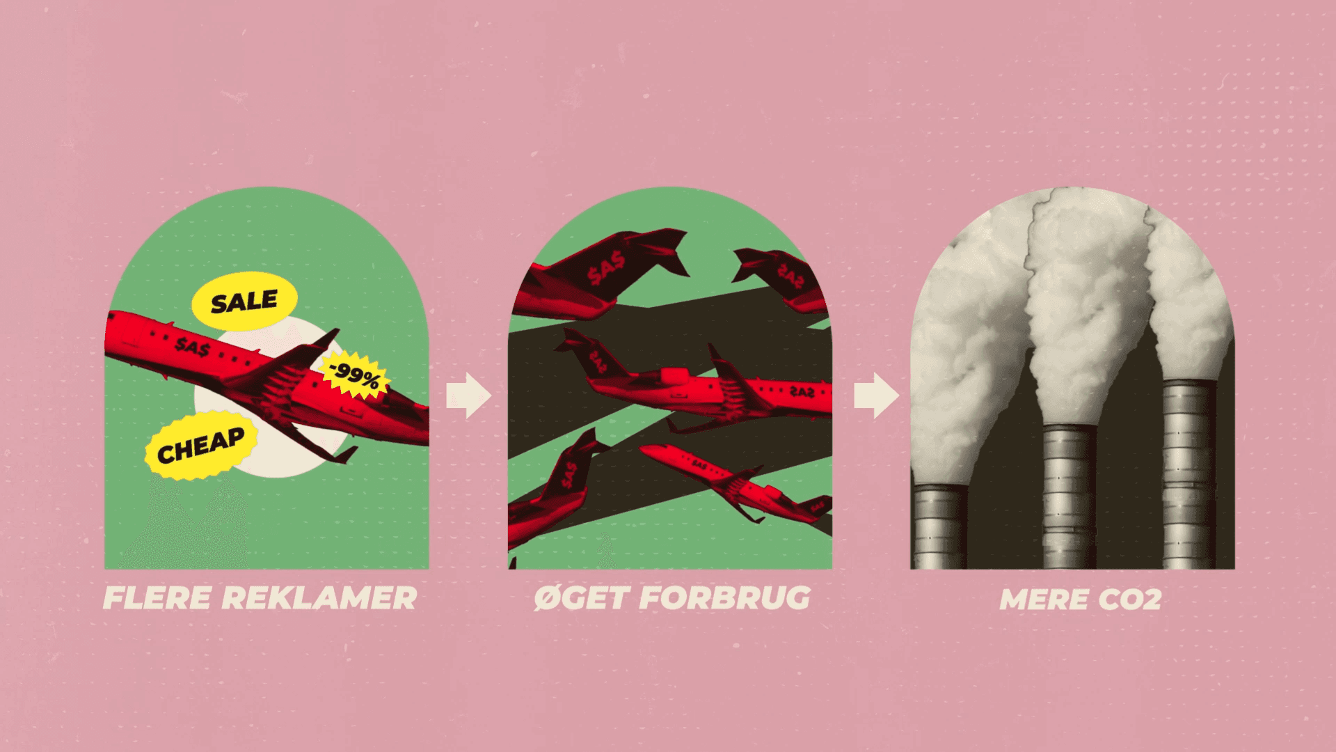
For Den Grønne Ungdomsbevægelse, we created an explainer video highlighting how ads for climate-damaging products harm the environment—and why a ban would make a difference, just like the ban on cigarette ads.
The visual identity takes inspiration from this historical ban. Using a collage aesthetic and warm tones, the style references old-school advertising—but with a twist. One of the primary color is deliberately off-putting, borrowed from cigarette packaging as a subconscious warning. In contrast, bold splash colors, reminiscent of promotional leaflets and bargain flyers, exaggerate the urgency of consumer culture. The overall style is intentionally over the top, carrying a hidden message about overconsumption and its impact.
Belastende Reklamer
Den grønne ungdomsbevægelse
2023
Services
Concept development
Campaign Identity
Storyboarding
Motion design
Video editing
For Den Grønne Ungdomsbevægelse, we created an explainer video highlighting how ads for climate-damaging products harm the environment—and why a ban would make a difference, just like the ban on cigarette ads.
The visual identity takes inspiration from this historical ban. Using a collage aesthetic and warm tones, the style references old-school advertising—but with a twist. One of the primary color is deliberately off-putting, borrowed from cigarette packaging as a subconscious warning. In contrast, bold splash colors, reminiscent of promotional leaflets and bargain flyers, exaggerate the urgency of consumer culture. The overall style is intentionally over the top, carrying a hidden message about overconsumption and its impact.


more werk —