RF25
Roskilde Festival
2024
Services
Visual Identity
Branding
Concept development
Motion design
Visual Backdrop
Agency: e-Types
Role: Designer
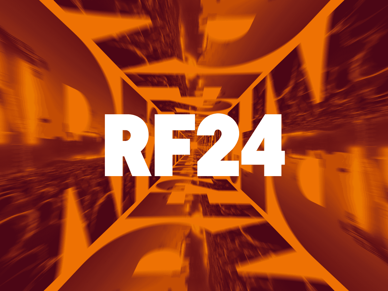
In 2024, we introduced the RF Cube. For Roskilde Festival 2025, we’re turning up the volume and diving deeper into the world of Roskilde Festival. As the festival’s main graphic element, the cube now becomes our perspective—seeing Roskilde Festival from the inside out, from your POV.
This approach brings a fresh and immersive feel to the identity while maintaining the recognizable structure and layout from last year. The iconic orange remains at the core, while bold, dynamic typography reinforces its raw and unfiltered spirit. The result is a visual universe that feels both new and familiar—capturing the creativity and youthfulness that define Roskilde Festival.


more werk —

